The Eight P's of Effective Opt-In Forms
Effective opt-in forms are a key element in the success of a business, providing a constant supply of new leads you can build a relationship with and sell to over time.
Yet many businesses are unnecessarily reducing their own revenues and success levels, and increasing their costs of advertising, when such forms perform poorly. Many struggle to survive as a result. Some sadly disappear. And it's all so unnecessary!
A few basic changes are often all it takes to radically improve the effectiveness of your opt-in forms, often doubling, tripling or more the number of leads generated.
So what exactly do you need to do?
The eight 'P's of effective opt-in forms #leadgen #leadgeneration #smallbusinessmarketing via @optinopoliClick To TweetEffective opt-in forms tend to take advantage of certain key factors that play a huge part in how they perform. And, making them somewhat easier to remember, they all start with 'P'!
This post shares what they are, and provides you with some awesome examples of businesses putting them into action.
Of course, most opt-in forms won't put them all into action. But just taking a few of them and adjusting your form accordingly can make all the difference.
Before we get started though, a big thank you to Andy Crestodina, whose excellent post on the 3 P’s of email signup forms inspired this one.

It goes without saying, your opt-in form should be noticeable. After all, you don't want it to be simply ignored.
So the more prominence you can give it, the more leads you’ll likely attract.
Here are some different ways to increase the prominence of your form.
Different ways to make your opt-in form more prominent and drive up leads #leadgen #inboundmarketing via @optinopoliClick To TweetColors
The use of color can be very effective for catching your visitor's eye.
For example, if the coloring of your current opt-in form blends in too much with the rest of your website, visitors may not even notice it.
A contrasting color or two can instantly increase the prominence of your opt-in form and the number of leads it generates.
Copy
Effective copy is of course vital for an effective opt-in form, yet many businesses employ copy that underperforms.
Dull copy will of course fail to attract the attention of visitors and reduce the prominence of your form.
Instead, you want short, sharp copy that quickly attracts your visitors' attention as they scan the page.
If you're unsure, and don't have someone on your team trained and experienced in copywriting, it pays to get some outside help.
Fonts
Use different fonts and font sizes to make your opt-in form stand out.
Fonts used on the web are generally increasing in size, because they hold the attention of visitors more effectively. Yet far too many opt-in forms use an overly-small font, causing visitors to barely notice it on the page.
Make Forms Dynamic
A static opt-in form is one that fits into the overall page layout. For example, it might sit within a sidebar.
By making that same form dynamic, you instantly increase its prominence and the number of visitors converted into leads.
Here are a few highly effective types of dynamic opt-in form:
-
Popups—like it or not, popups simply work! They immediately get the attention of visitors, simply because they're in the way of the content on the page. Yes, they can be annoying, but that doesn't mean they don't work or aren't of value to visitors. If this is a concern, you can employ them in ways to minimize the 'annoyance factor' while still taking full advantage of their effectiveness. For example:
- Have a popup appear when the visitor's about to leave.
- Only show it once per session.
- Delay showing it until they've been on the page a few seconds, or scrolled down a certain amount.
- Ensure you're offering something of value and interest to visitors.
-
Welcome Mats—for maximum prominence, this takes over the full page and appears over the top of existing content, usually when the visitor first arrives or when they exit. The visitor can't ignore it, instead forcing them to choose between:
- Opting in.
- Dismissing it so they can view the content underneath.
- Leaving the page completely.
- Sticky offers—sometimes called a 'floating' or 'sticky' bar, your opt-in form is shown in a bar towards the top or bottom of the screen, which may or may not stay visible as they scroll. This type of dynamic form allows you to catch the visitor's attention as they scroll, without being overly intrusive.
(How do you go about adding dynamic forms like these to your website? Try using optinopoli which lets you get started for free).
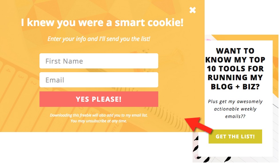
As an example of one of these types of dynamic form, here's a popup from Hugh Culver’s website, hughculver.com. It appears shortly after you arrive:
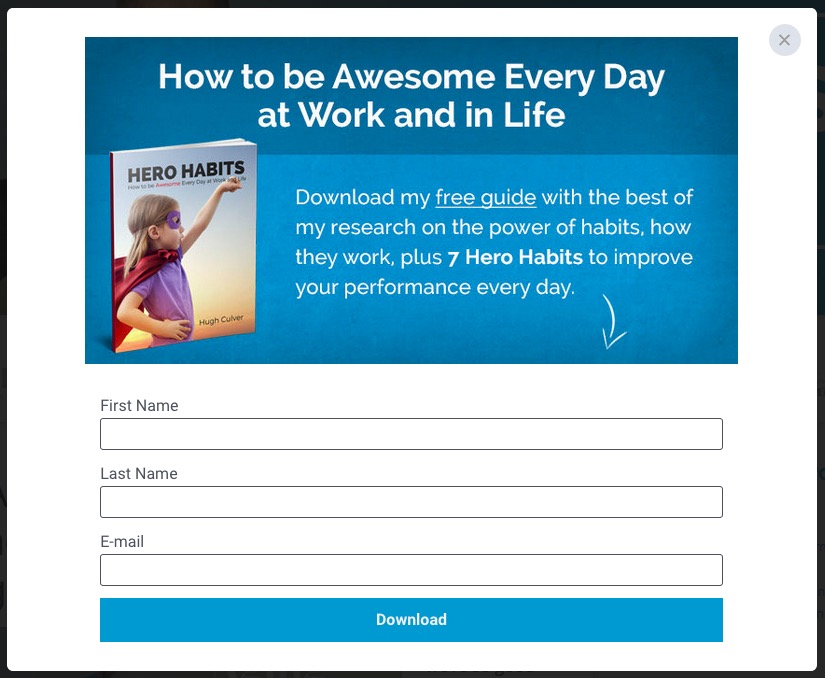
Once the visitor subscribes via one of these dynamic forms, it disappears. The visitor is shown a confirmation of some kind, and they can continue as normal.
Position
Generally speaking, the higher up the page you position the opt-in form, the more likely you are to grab the visitor's attention. For example, if it's in a sidebar, stick it right at the top.
Most advice will also tell you a top-right position outperforms top-left. But how accurate is that really?
BabelQuest did some research that found top left outperformed top right across a range of websites by over 43%.
The bottom line is that you always need to test out what works best on your own website.
White Space
Don't cram everything in too tightly on your web pages. White space can be surprisingly effective for increasing the prominence and effectiveness of your opt-in forms.
Many business owners and web developers feel compelled to avoid white space, yet it can simply create visual overload for visitors.
By doing the opposite, the number of leads your form generates can increase markedly. For example, UXPin ran a test and found that adding whitespace into the design increased conversions and engagement levels by up to 20%.

Take care over the presentation of your opt-in form so that:
- It's easy for visitors to use.
- Your offer is clear and visually appealing.
Here’s a fine example from Ian Cleary’s RazorSocial:
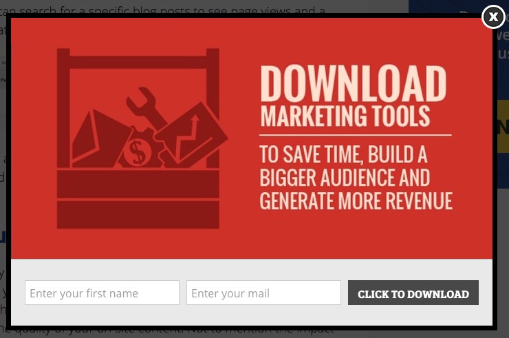
The offer is clear, with short, sharp copy, and it's a clean, crisp design with effective use of graphics.
Present opt-in forms so they're easy to use with a clear, visually-appealing offer #leadgen via @optinopoliClick To TweetYou don't have to use graphics though. You can still have a well-presented and effective opt-in form without.
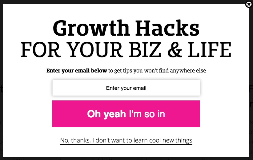
Here's an example of a text-only form from JenLehner.com:

Your opt-in form offers an exchange. You're essentially promising the visitor that in exchange for their email address, they will get a certain benefit or value back.
What's the 'Promise' on your opt-in form? Does it have sufficient appeal to your target market? #leadgen via @optinopoliClick To TweetSo what is your 'Promise'?
This essentially is your 'Lead Magnet'. It's what you're offering to your target market to attract leads into your business.
Here’s an excellent example from Kate McKibbin’s Secret Bloggers’ Business site.
Her 'Promise' here is to provide a 200+ page planner and accompanying workbook to all those who drop in their details. It appeals directly to the type of lead she's aiming to attract.

Ask yourself some important questions about your own 'Promise' to prospective leads:
- Would an alternative Lead Magnet—a different Promise—be more effective?
- Does it have sufficient appeal to the type of lead you're aiming to attract?
- Would it attract leads with an interest in what you sell? (If you're stuck, here's how to create a top converting Lead Magnet that sells)
- What could be improved?
There's a whole range of different Lead Magnets available, such as the following:
- A free consultation, or quote for a job.
- Regular updates, tips or a newsletter.
- Access to exclusive content, such as video.
- An opportunity to join a community such as a Group on say Facebook or LinkedIn.
- Something they can download such as a report or some software.
- And a whole lot more...
So test out different approaches, and see what works best for your market.
But it’s not just about the Promise itself.
It’s also about how you relay that to your prospect. One of the most important factors is of course the headline. Different wording can have a huge effect on the effectiveness of your opt-in form.
So be sure to test different headlines against each other (see Performance below) to find wording that works best for your market.

As the old adage goes, people prefer doing business with people, rather than faceless entities. That includes your opt-in form.
So improve the effectiveness of your opt-in form by injecting personality. Use both suitable imagery and/or language.
Inject personality into your opt-in forms to make them more effective #leadgeneration #smallbusiness via @optinopoliClick To TweetDoing so makes your opt-in form far more appealing, improving your conversions.
Sarah Morgan has an awesome example of this on her xosarah.com website, injecting her personality into the language used in order to engage and connect with the visitor. Clicking the button via the ad in the sidebar launches the popup:
Here's another great example. This one's from Donna Moritz at Socially Sorted.
Instead of a stiff portrait, her personality's reflected all over her face. You instantly feel a sense of connection as if you're long-lost buddies meeting at a social event!

(As a useful aside, note where her eyes are going. She’s looking to the right of the page, which the visitor's eyes unconsciously follow, guiding them straight to the call to action).

Are you sometimes terrified of making the wrong decision?
If so, you're not alone. Most people have it to some level.
It even has a name. Walter Kaufmann from Princeton University calls it decidophobia.
What's more, it has a direct impact on the number of people who fill in your opt-in form.
The more you can help people forget or overcome that fear, the more leads you'll generally attract. You do that by providing Proof.
Add Proof to your opt-in forms to make them more effective and drive up leads #leadgeneration #marketingtips via @optinopoliClick To TweetThat includes:
- Proof of your credibility and authority.
- Proof that your Promise (see #3 above) is genuine.
Here are a couple of main ways to do that.
A. Social Proof
You’ve no doubt seen evidence of social proof on opt-in forms yourself. Here are four ways you can put it into action.
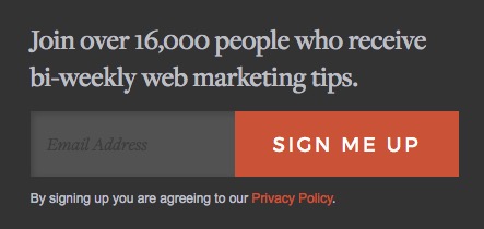
1. Subscriber numbers
This employs language such as, “Join our community of 14,512 small business owners…” (replace small business owners with any other niche).
Not only does it tell the prospective lead or subscriber that thousands have already followed the same route, immediately increasing trust, but that those who did so are like-minded people. Therefore it must be fine to do the same.
Here’s an example of this in action from Orbit Media:
2. Traffic levels
If you're getting a ton of traffic, why not let prospects know how popular your website is?
Jamie Turner puts this into action on his 60 Second Marketer website:
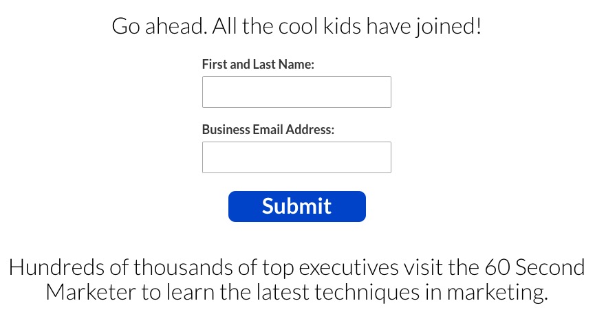
Note he also makes it clear who he serves (executives interested in marketing), while employing FOMO (fear of missing out) in the phrase, All the cool kids have joined!
3. Social media
Where better to provide social proof than via social media?
If you're rocking it on social, then let people know on your opt-in forms how many you're reaching.
You can also try adding a follower widget somewhere close by.
4. Testimonials
Testimonials are very powerful for providing social proof and increasing people's trust in what you provide.
This gets more powerful still when it's from a well-known personality in your niche. If you're a relative unknown, and someone already trusted bestows confidence in you, that trust immediately transfers to you.
B. Visual Proof
It's often asserted that the human brain processes visuals 60,000 times faster than text. It's also said that images increase engagement by over 100%.
So what type of visual proof can you add to your opt-in form?
Here are some ideas:
- 3D representation of a download—are you offering say a report, ebook or even some software? A professionally created 3D image of it can increase its perceived value, and help prove that what you're offering exists.
- Thumbprint of a video—prove the existence of the video(s) you're offering, while encouraging people's desire to watch it.
- Authority visuals—are there media logos you can add to indicate outlets you've been featured on? Do you have an image of you speaking to an audience?
- Success visuals—if you're helping others achieve success in a particular field, do you have images that prove your own success levels? For example, a business or financial success coach might picture themselves next to their private jet. A sports coach might show themselves next to a sports celebrity they've assisted.
- Before and after pictures—this works well in niches such as fitness, dieting and home improvement.

Are you continually testing different aspects of your opt-in forms to optimize their performance?
If so, you're a welcome exception. Most businesses don't, largely because of either ignorance and/or inertia. It means they're likely only achieving a fraction of the potential leads they could otherwise be generating.
Test the Performance of your opt-in forms to drive up conversions #splittesting #leadgen via @optinopoliClick To TweetThe good news is that, by starting to test, you can quickly get ahead of the pack.
As well as increasing the conversion rates of your opt-in forms, it also makes any ads pointed to them a lot more cost effective, making it easier to scale.
So it's essential to continually split test your opt-in forms.
A single test can easily increase your conversion rate by 20%, 30% or higher.
Thanks to compounding results, it only takes three such tests—one with a 20% lift, two with 30%—to double your conversions overall.
If you double your conversions, you're getting twice the number of leads for the same amount of traffic.
What's not to love? Here's more info on how to double your leads using split testing.
HINT: An easy way to quickly increase your opt-in form conversions is to reduce the number of fields where possible.
Review each form and ask if you really need each bit of information requested.
For example:
- Are you asking for a phone number when in reality no one will actually call them?
- Do you really need their name? Or could you ask for this at some point after you've already got their email and are communicating with them?

Is your opt-in form problem-free?
Sadly, many opt-in forms have issues that cause leads to abandon the form, head elsewhere and never give you their details.
That's a complete waste. They'd already made the commitment to sign up, why lose them right on the finish line?
Avoid common Problems on your opt-in forms to stop losing leads that should be yours #leadgen #smallbusinessmarketing via @optinopoliClick To TweetThe good news is most problems that cause leads to abandon opt-in forms in this way are easy to fix and fall into a few common categories.
Take the time to test your opt-in forms thoroughly, and ensure they don't have issues like the following.
Browser Incompatibility
Are you sure your opt-in forms:
- Work properly?
- Look as they should across the major browsers?
It's a surprisingly common issue where, for visitors using a specific browser, the submit button simply doesn't do anything, or the form doesn't look right.
The website owner is generally unaware of this type of issue. After all, they continue to get leads coming in from visitors using other browsers.
So until a visitor is good enough to alert them to the issue, they'll go on losing leads.
Make sure you're not affected by ensuring you check your opt-in forms across multiple browsers, prioritizing those your visitors use the most. Generally speaking, these are the main ones:
- Chrome
- Firefox
- Edge
- Internet Explorer
Mobile Device Problems
Does your form work properly on mobile? Have you tested it thoroughly on a mobile device?
On most websites, a good proportion of visitors are now on mobile. On some, it's more than half.
So be sure to test across different devices.
Here are some common issues to look out for:
- Do fields for an email address and telephone number use the appropriate underlying type? This makes it significantly easier and quicker for a mobile user to fill in your form.
- If an email address field uses the email type, the mobile user will generally see a keyboard optimized to enter in an email address. They may also see their main email address to tap and auto-fill the field.
- Similarly if a phone field uses the tel type, they'll see a numeric keypad, and potentially their phone number, again to tap and auto-fill the field.
- Does the form look okay on a mobile device? Issues might include the following:
- A submit button that's off-screen and unreachable by scrolling.
- Layout issues that make it hard or impossible to use, or simply looks unprofessional.
- Does your opt-in form work properly on mobile?
- Can information be properly entered into all the fields?
- Can the form be submitted once you've entered in the information?
- Are validation issues properly presented, if for example a required field is empty?
Validation Problems
These are some of the most common problems with opt-in forms, often because no one thinks to properly test these aspects.
They test the form with all the information entered correctly, and don't think to test for when the visitor does the unexpected.
Invalid Validation!
Does your email validation work as it should? Are you falsely disqualifying email addresses that are actually perfectly correct?
A common issue is to disallow newer domain TLDs. Is someone with an email address like john@ieat.pizza able to submit the form?
But it's not just email. Other issues with validation not working correctly include the following:
- Fields marked as optional, which are then shown as invalid if submitted empty.
- Asking the visitor to fill in a field which isn't on the form.
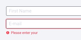
- A mismatched validation message, such as one requesting a full name in a field labelled First name.
- Incomplete validation messages, or messages that don't make sense. Here's such an example from a prominent blogger and social media influencer (yes, it happens to anyone!):
Distracting Validation
This relates to opt-in forms where a validation message appears as soon as you start to type.
It's unnecessary and causes you to lose leads through form abandonment because of:
- Irritation—it's only going to annoy visitors to tell them their email is invalid before they've finished entering it.
- Confusion—if visitors feel confused by what you're asking them to do, they'll simply leave.
- Distraction—it is of course distracting to flash up an error message as soon as someone starts to enter information. On mobile, it may even jolt the position of the form and the field they're in. Again, it increases the chances they'll simply leave.
Best practice is to show validation messages once a visitor has left the field.
Negative Messages
If your visitor makes a mistake on the form, do your validation messages have a negative tone?
Do they criticize the visitor, point out failures, and focus on what's wrong, rather than simply tell them what's required?
Overly negative messaging can cause frustration, annoyance and drive up form abandonment.
Consider the following examples:
- Errors below
- You didn't fill in the form!
- 2 errors on form - unable to submit
- Email is invalid
- Submission failed - correct errors and try again
Review your validation messages with your developer. Rework as required to make them more positive and tell them what they need to do to submit the form successfully, such as:
- Please enter your first name
- Please enter a valid email
Making Them Reenter Information
For some forms, when submitted any fields with incorrect information are emptied. This forces the visitor to start from scratch, causes unnecessary frustration, and makes them question what they did wrong.
Instead, ensure the visitor can simply correct the information already in the field.

Concerns about privacy are on the rise globally. To feel confident in giving you their private information, people want to know you take their privacy seriously.
Here’s an example from Sue B Zimmerman. The unobtrusive privacy notice simply states, We collect, use and process your data according to our Privacy Policy, and links to the policy in question.
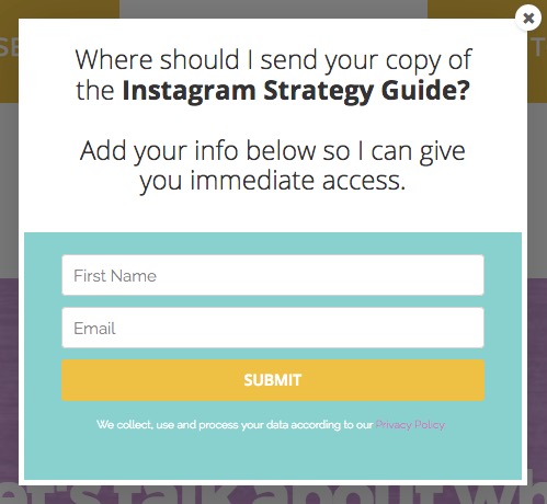
Displaying an appropriate privacy notice can certainly increase your conversions. But not always.
Adding a #PrivacyNotice to your opt-in forms can increase conversions. But not always. #leadgeneration via @optinopoliClick To TweetFor example, a test in Which Test Won's archives shows the addition of a privacy notice (Version B below) increased conversions by 19.47%.
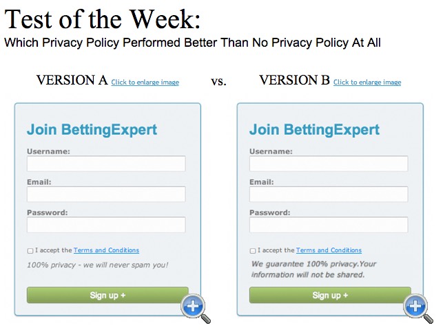
Yet a different notice using the words, 100% privacy - we will never spam you, decreased conversions by 18.7%. Possibly the word spam increased rather than decreased people's privacy concerns.
Here's another example from VWO. This website tested using the privacy notice, We respect your privacy, alongside a small padlock. Conversions dropped by 24.41%.
So while showing a privacy notice is important and can increase conversions, unless you test the way in which it's worded and presented, you risk reducing the effectiveness of your opt-in form.
To Conclude
Review your opt-in forms against the 'P's on this list to make them more effective and increase the number of leads they generate.
By putting even just a few of them into action, it's almost guaranteed your conversion rates will increase, driving up the number of leads you attract from the same amount of traffic.
Remember to test your changes carefully so you're aware of the difference they make and can continue to optimize and improve.
The 8 'P's of effective opt-in forms #smallbusinessmarketing #leadgen #emailmarketing via @optinopoliClick To Tweet
steve shaw
Steve Shaw is the CEO of optinopoli™, next-generation lead capture and sales conversion technology—click here for more info.

Comments